Open Apprenticeship Branding
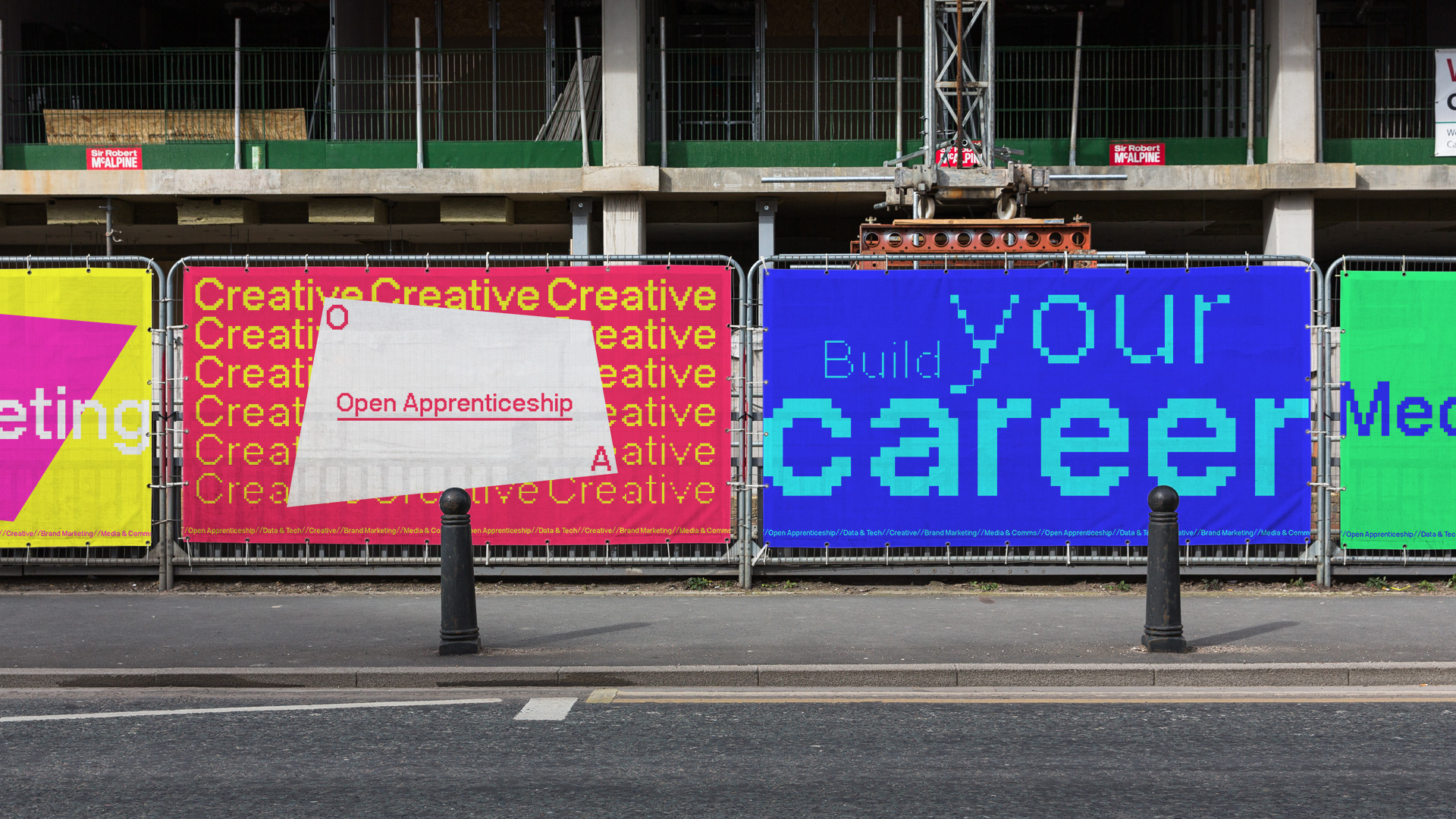
In 2020 Publicis launched a new digital focused apprenticeship program. Targeting a more diverse set of candidates typically underrepresented in the advertising industry we set out to create a brand identity that was bright, colourful and captured the idea of diversity and building your career up.
ROLE
Design Lead/Art Direction/Motion Design
CLIENT
Publicis
The Logo
The aim of the campaign was to highlight people who maybe don't typically 'fit' the mould of advertising and so we wanted to represent that with a logo that can morph and change into multiple variants. We then used the logo as a frame to hold content and colours in the rest of the design language.
Typography
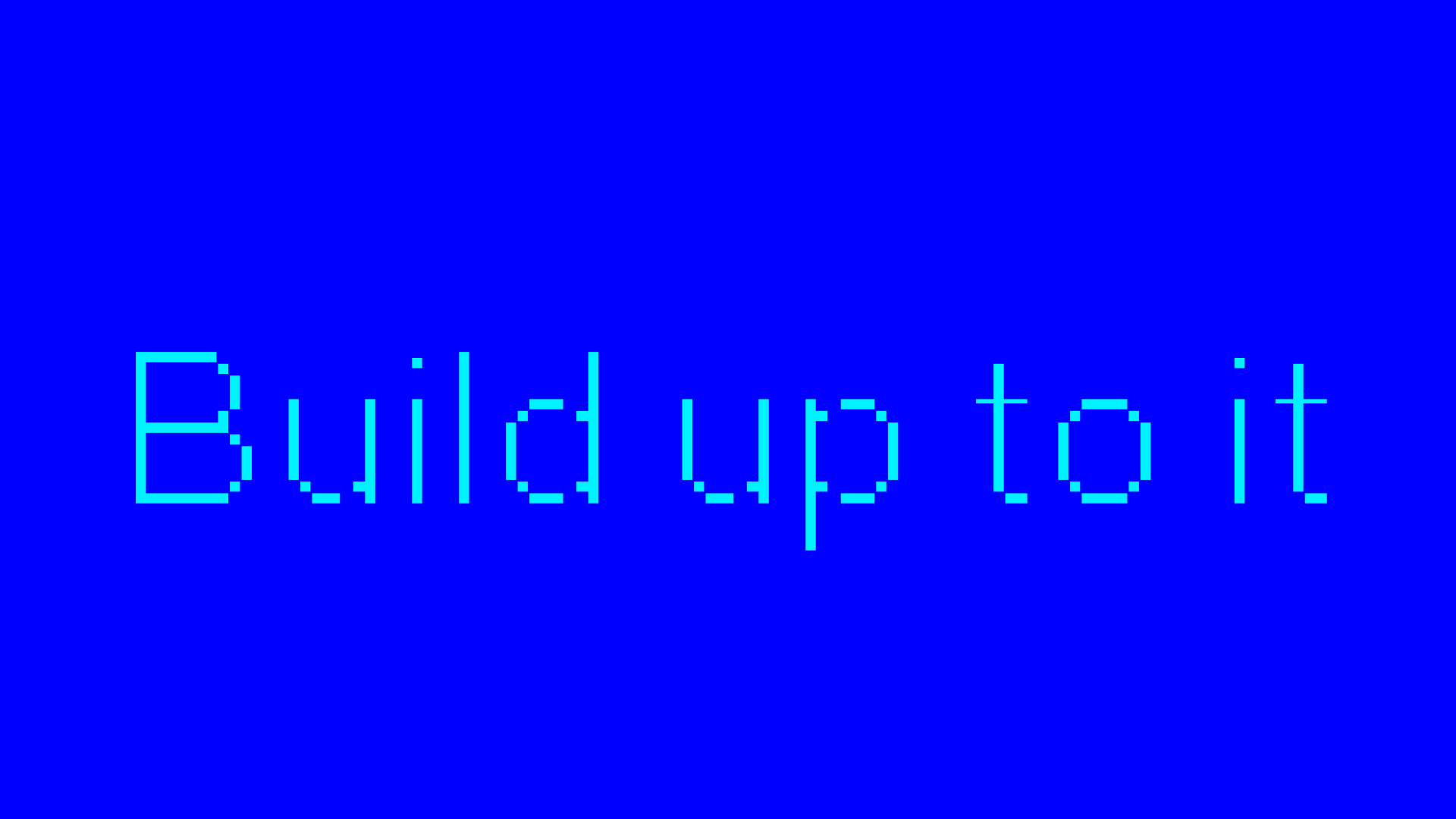
We wanted to make the design clear that it was heavily digital based so we used a modern 8-bit style font to act as the main font for the brand. We then started playing with weighting and cutting bits of the font away and layering them to get a sense of building up throughout the design language. We brought this through again in motion building from a smaller size to a bigger size.
Colour
The programme had 4 different areas. Creative, Data & Tech, Brand Marketing and Media & Comms. We created a two tone colour combination for each section aswell as an extra dual blue tone for general usage. We kept the colours really vibrant and bright to keep the designs feeling positive and motivational.